

If hearing the word “fonts” makes you think of Times New Roman and Arial, you are a bit late to the party. Digital marketing is now quite far for those simple Word options — stylish typography is an essential part of any design nowadays, including emails. Let’s take a look at some of the hottest font trends of 2021 to make your next email marketing campaign truly eye-catching.
Email design as a part of a strong content strategy
It’s no secret that email marketing is one of the most cost-efficient ways to attract and engage more customers. With a well-thought-out email strategy, you can easily turn each invested dollar into $44. How to do that? Just two aspects: good design and convincing writing. If the writing part is quite self-explanatory (you have to offer a unique and useful product), it is a bit more complicated with the design. What makes an email stylish? And how do you actually design it? You can place a banner in your email using the best design practices and trends. Or, more interestingly, try adding an attractive signature.
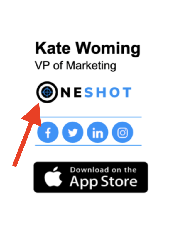
- Email signature design
Your signature should come with every email you send, and it’s best if it is not just your name and phone number. Nowadays, you can add photos, illustrations, links, and more with email signature software to make your letter attractive and interesting for the readers.

Image source: https://newoldstamp.com/email-signature-examples/
In this way, your emails always have all the relevant information, such as links to your products or recent blog publications. It is even possible to draw signature to make it truly special: hand drawings are among 2021 design trends. Talking about those, let’s start reviewing some of the most peculiar font trends.
Big, bold fonts
This font trend is quite simple: if you want people to notice your message, make it big and bold. It is easy to make your design stand out with such a font: it is readable and plays on the contrast.
Big fonts can be combined with a set of bright colors as well as elegant black-and-white designs. With such fonts being quite expressive, it is essential to maintain balance and not use too many colors, or your banner might become rather messy and too striking.
Bold typography brings the text into the center of attention and emphasizes the message: this is the effect you might want to achieve when having limited space of an email banner available. This approach also structures your design: no distractions for the reader.
Moving typography
If just bold letters seem too basic, the moving typography trend is right up your alley. Adding some motion looks refreshing and definitely catches the eye. Animation remains one of the biggest overall design trends; typography is not an exclusion.
You can make your letters change their position, become bigger and smaller, or simply hover in the air. These fonts can move on their own or come to life when a user clicks on them.
While interactivity does bring a lot of fun, it’s crucial to consider the readability of such fonts. Remember that animated fonts do not always look good on all devices, so proper responsiveness testing is a must.
The speed of the animation is also worth considering. Think about the message: do you want the receivers to actually read it, or your aim is to attract the attention and simply entertain them? Those are two different things.
Standout letters
Usually, fonts are made to blend in and match the design. The standout letters trend is the opposite of this boring rule. We can bet that you can easily remember FedEx’s logo because of how D and E blend together into one letter.
Standout letters are made to represent the idea behind the brand and give a hint about the product you are selling. It is a fantastic way to add some personalization to your design and make your logo an easy-recognizable one. Just use your creativity and don’t be afraid to experiment a bit — unusual logos do catch one’s eye.
Stretched, twisted, contorted fonts
One more trend for those looking for a somewhat unusual style. This aesthetics is heavily influenced by the 80s independent art scene. Such fonts look quite cool and even edgy. They are definitely not for every project.
Breaking the rules suits independent brands willing to emphasize their uniqueness. Such typography has the spirit of freedom, so it is a popular choice among brands targeting generation Z.
You should be careful with these fonts. While looking amazing, they are not always quite readable, so think of them as rather art elements than a way to convey a message. Of course, there are different degrees of disruptiveness, and it is up to you to choose how weird you want your design to get.
Image source: https://stripo.email/blog/best-fonts-email-usage-tips-tricks/
Retro fonts
People like nostalgia: from “Stranger Things” to The Weeknd’s hits, references to the past make us feel cozy and think about “good old times,” even if we weren’t even born back then. Nostalgia is very trendy in the design at the moment, mainly in the form of retro fonts.
Let’s be honest, the 60s and 70s style fonts look incredibly stylish. They are minimalistic yet not boring. Retro fonts are also often bold, which makes them even more trendy. Combine this with vivid colors, and here you go — stunning typography that evokes all the warmest feelings and shows that you know what’s buzzing these days.
The bottom line: staying relevant
Trends come and go; you might like some of them and dislike the others. Being aware of the current trends is not about mindlessly following what others do — it is a way to stay relevant and apply the best design practices. Remember that just a few years ago responsiveness was a new trend, while now it is simply a requirement for any decent design.
Trends can look organic if used wisely. Every time you are unsure about using a certain trend, rely on your own style and business needs: not each brand should use retro fonts or go for disruptive typography.


